SAFEFIT COMPASS
DESIGNED 2024
Helping people recover safely through personalised fitness guidance
ROLE
Project Lead -
UX Designer
TIMELINE
8 Weeks
TEAM
2 UX Designer, 2 UI Designer & 1 Researcher
TOOLS
Figma
Figjam
Notion
Miro Board
SKILLS
Product Design
User Research
User Interface
User Testing
OVERVIEW
SafeFit Compass is a mobile health and fitness concept designed to support people recovering from musculoskeletal injuries or managing everyday pain.
The project was completed as part of a Health & Wellbeing UX Design module and followed a full end-to-end UX process, from user research to usability testing.
THE PROBLEM
People dealing with everyday pain want to stay active, but most fitness apps make it harder rather than safer.
Most platforms comes with:
Generic workout plans
Lack of safety guidance
Low motivational hook
PROJECT GOAL
Design a recovery-first fitness experience that helps people move safely, confidently, and consistently. The goal was to remove unnecessary complexity and focus on clear guidance, personal relevance, and gentle motivation for users managing pain or injury.
The solution aligns with UN SDG Goal 3: Good Health and Well-Being, promoting inclusive and accessible health support.
RESEARCH & DISCOVERY
Research focused on understanding how people with everyday pain approach fitness and where existing apps fall short.
Research Goal
Understand the needs, fears, and behaviours of people with musculoskeletal conditions
Identify gaps in existing fitness and recovery apps
Validate assumptions around safety, motivation, and personalisation
Methods
Online Survey
Secondary Research
Competitor Analysis
Key Findings
75%
Personalised Workouts
65%
Progress Tracking
60%
Wearable Integration
55%
Video Guidance
Personas
This combined persona and empathy map captures how everyday pain, time pressure, and uncertainty shape fitness decisions for busy professionals.
Key Takeaways from Empathy Map
Users want results quickly, without long routines or complex setups
Unclear guidance increases fear of doing exercises incorrectly
Time pressure leads to skipped workouts, even when motivation exists
Confidence drops when progress feels slow or invisible
What it meant for design?
Fast access to relief-focused exercises
Step-by-step visual guidance for correct form
Short routines that fit into busy schedules
Simple progress indicators that motivate without pressure
Journey Map
The journey map was used to understand how users feel at each stage of interacting with the app and to identify where confusion, doubt, or disengagement occurs.
Rather than focusing on tasks alone, we looked closely at emotions and effort across the experience.
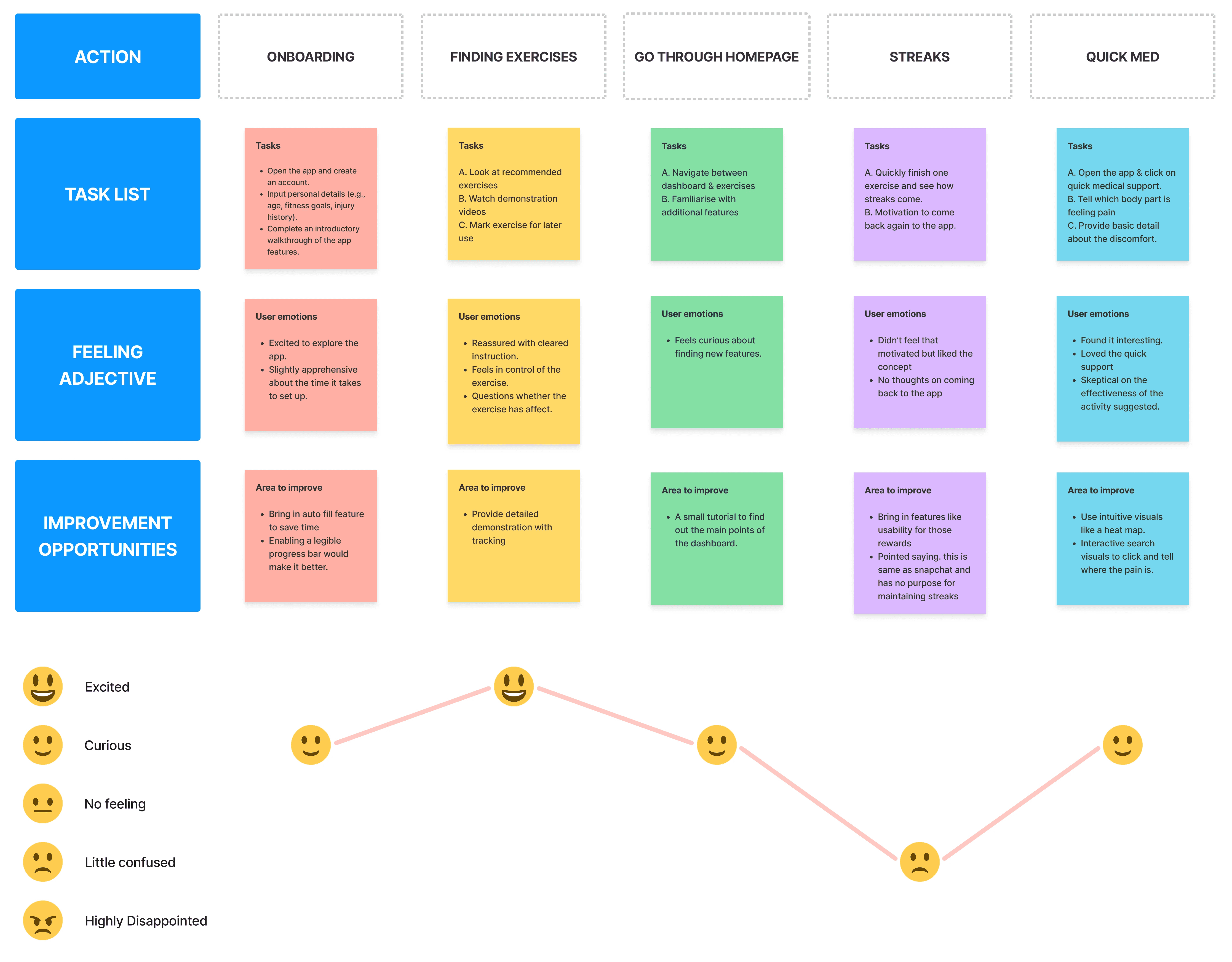
What we observed?
ONBOARDING:
Users felt excited to start but slightly apprehensive about setup
Too much upfront input increased hesitation early on
FINDING EXERCISES:
Clear instructions reassured users
Users questioned whether exercises were actually helping
STREAKS & MOTIVATIONS:
Curiosity was high, but navigation effort mattered
Users preferred guidance over exploration
QUICK MED:
Users engaged fastest during moments of discomfort
Immediate, targeted support felt useful and reassuring
Skepticism reduced once guidance felt clear and actionable
Emotional Insight
The emotional low point occurred when users felt unsure whether their effort was meaningful or safe.
This dip highlighted the need to:
Reduce cognitive load
Make outcomes clearer
Support users during moments of pain, not after
What this meant for the design?
Based on the insights we managed to pen down the requirements for users as followings:
Simplify onboarding and reduce early friction
Prioritise clarity over choice when suggesting exercises
Surface Quick Med as a primary action during pain moments
Reinforce progress in small, visible ways
Information Architecture
The information architecture was designed to minimise effort and decision-making, especially during moments of pain or uncertainty.
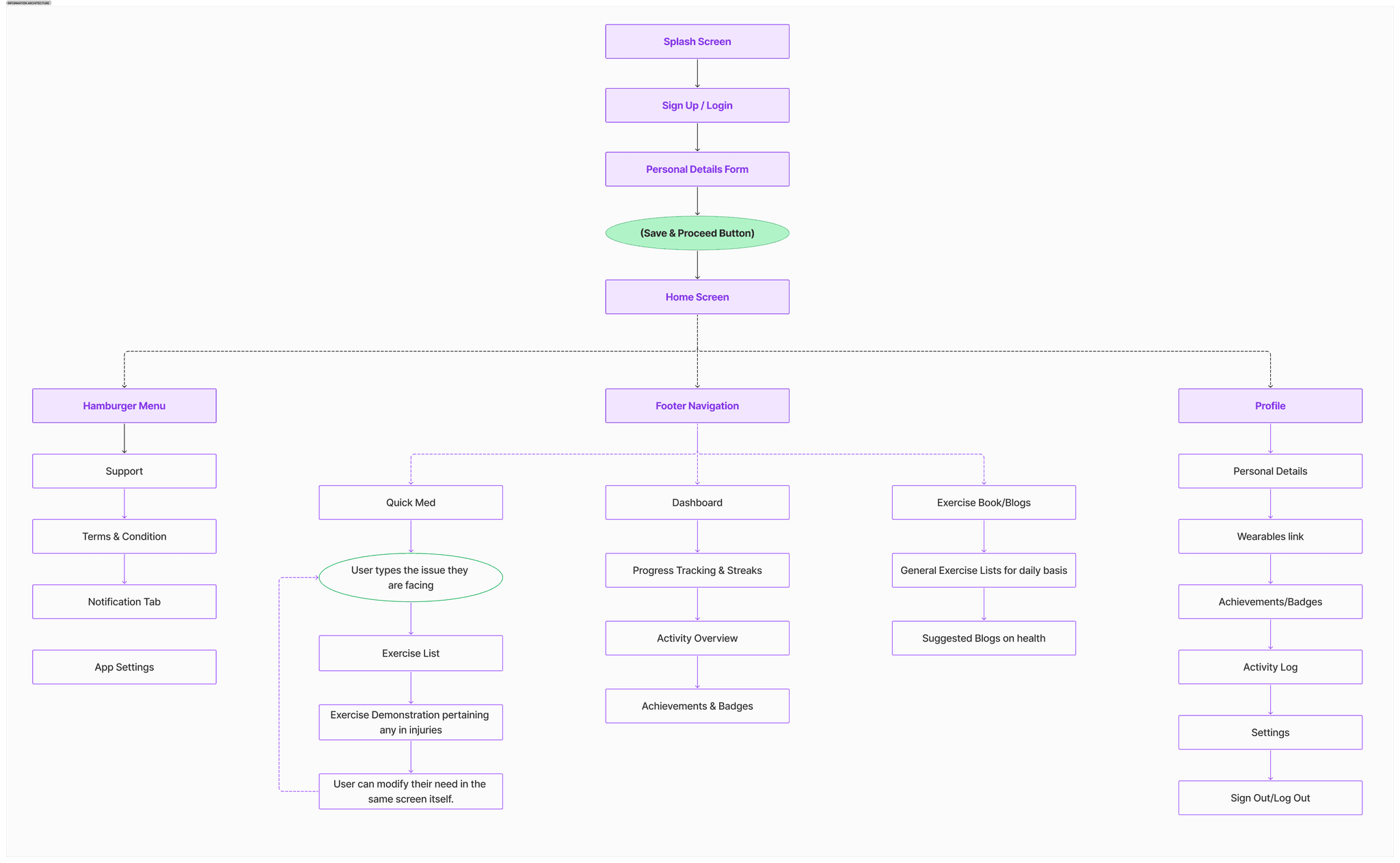
Key Information Architecture Decisions
SIMPLIFIED ONBOARDING:
Collected only essential details upfront
Deferred deeper inputs until users were more comfortable
QUICK MED - PRIMARY PATH
Positioned Quick Med as a top-level, easily accessible action
Reduced steps from problem → relief
CLEAR SEPARATION OF INTENT
Immediate relief (Quick Med)
Long-term progress (Dashboard & Streaks)
Learning & support (Exercise Library & Blogs)
MINIMAL NAVIGATION DEPTH
Core actions reachable within one or two taps
Secondary actions grouped under profile or menu
Structuring the app around user intent—rather than features—helped reduce cognitive load and supported faster, more confident actions.
THE SOLUTION
LOW FIDELITY DESIGN
Low-fidelity wireframes were used to explore flows early and validate simplicity before investing in visual design.
What we explored
PRIMARY USER FLOW
Onboarding to home screen
Finding relevant exercises
Accessing Quick Med during pain moments
Viewing progress and streaks
NAVIGATION CLARITY
Ensured key actions were reachable within minimal steps
Tested whether users could move through the app without confusion
Key Design Decisions
DESIGN FOR SPEED
Reduced unnecessary screens and choices
Prioritised direct paths to relief and guidance
QUICK MED VALIDATION
Tested whether users could reach pain-specific help quickly
Refined steps to keep the flow short and focused
PROGRESS WITHOUT PRESSURE
Explored lightweight ways to show streaks and progress
Avoided overwhelming dashboards or metrics
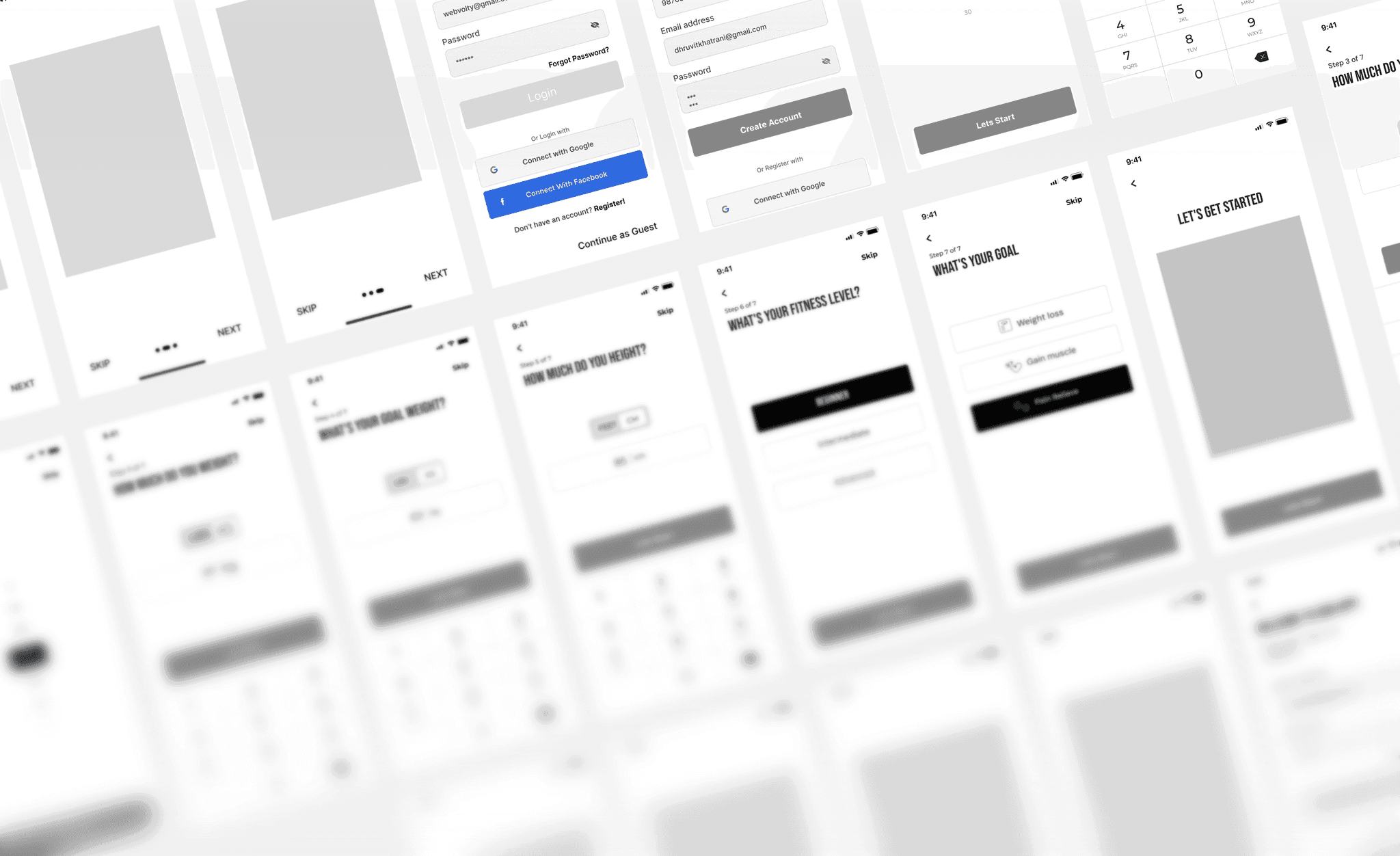
Early wireframes confirmed that fewer steps and clearer intent increased confidence and reduced hesitation.
HIGH FIDELITY DESIGN
SafeFit Compass was designed to support users in moments that matter most — from immediate pain relief to building a safe, long-term routine.
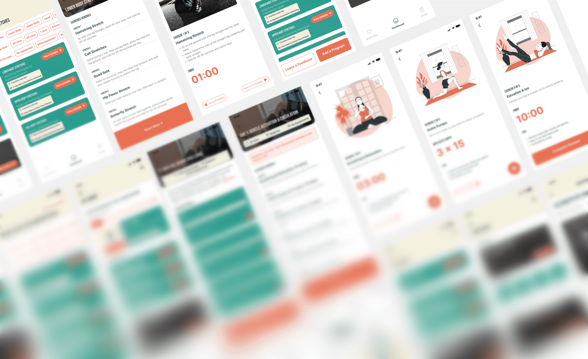
QUICK MED FLOW
Quick Med helps users move from pain to action within seconds. Users select the area of discomfort and receive clear, guided exercises with minimal steps and decision-making.
IT PROVES:
Speed, clarity, and reassurance during high-stress moments.
REHAB FLOW
The rehab flow supports safe, structured recovery from the home screen. Exercises are personalised and guided, helping users build consistency without fear of doing something wrong.
IT PROVES:
Long-term use without overwhelming the user
GUEST MODE FLOW
Guest mode allows users to explore and get help without commitment. This reduces hesitation and lets users experience value before sharing personal details.
IT PROVES:
Low friction and respect for user readiness.
SIGN UP FLOW
The sign-up flow is intentionally lightweight. Only essential information is collected upfront to personalise recovery while keeping onboarding simple.
IT PROVES:
We didn’t let onboarding become a barrier.
OUTCOMES & LEARNINGS
OUTCOME
SafeFit Compass resulted in a recovery-first fitness experience that prioritises clarity, safety, and ease of use for people managing pain or injury.
Through iterative design and validation, the final solution demonstrated that reducing steps and choices helped users feel more confident and supported during both pain moments and long-term recovery.
What worked well?
Designing around real moments of pain, not ideal scenarios
Prioritising Quick Med as a primary user need
Keeping onboarding and navigation intentionally lightweight
Using visual guidance to reduce fear of doing exercises incorrectly
What challenges we faced?
Ideas went off-scope during early ideation, requiring frequent refocusing on core needs.
Time constraints limited how many concepts could be fully explored or delivered.
Key decisions were delayed due to repeated validation.
Some planned features were deferred to avoid adding complexity and maintain clarity.
Key Takeaways from the project:
Users value confidence over performance
Clear guidance matters more than feature depth
Designing for emotional states (anxiety, pain, doubt) leads to better outcomes
THANK YOU!